“If I were asked to say what is at once the most important production of art and the thing most to be longed for, I should answer, ‘a beautiful house’.” William Morris

Some may find it strange for a guy to admit, but I’m passionate about interior design. I love the variety of elements that go into a pleasing design, the interplay of line and form with color and light, and the positive effects of good design in a home, church, or business. I’ve found a well-designed space can actually facilitate openness to God’s spirit. In fact I think that God is a fan of interior design, as well. He certainly enjoys all the elements of it, as we can see by the abundance of these things in nature. In fact, you could say that he is the original interior designer, having conceived and executed the incredible interior design in humans, animals and plants. He is a master of mixing form and function.
As much as I love writing, visual art, and the ministry God has called me to, I can’t get away from working with interior design. And my wife loves it, too. Danielle and I are opposite personalities in many ways, but when we can compromise on design ideas in our home the result is eclectic and (I think) inspired. In fact, I could tell you many stories about how God has inspired or blessed our design process; like the blue leather chair he led me to at Goodwill for $35, or the set of 100 year old candelabras I got for $8 at a random garage sale, or the deeply discounted Crate and Barrel rug he dropped in front of me that, as “the Dude”from The Big Lebowski would say, “…really ties the room together.” In fact, another thing some may find odd, I’m the one in our relationship who enjoys shopping for design items (clothes are not included in this category). If you want to know where to get a certain sofa, table, lighting, or drapery in town, I can tell you and may even find it for you.
OK…I guess I’ll show a few pictures of the house. And here is a link to before and after shots.
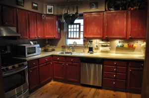
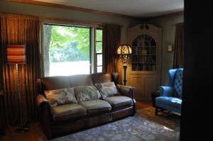
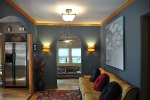
Kitchen Remodel
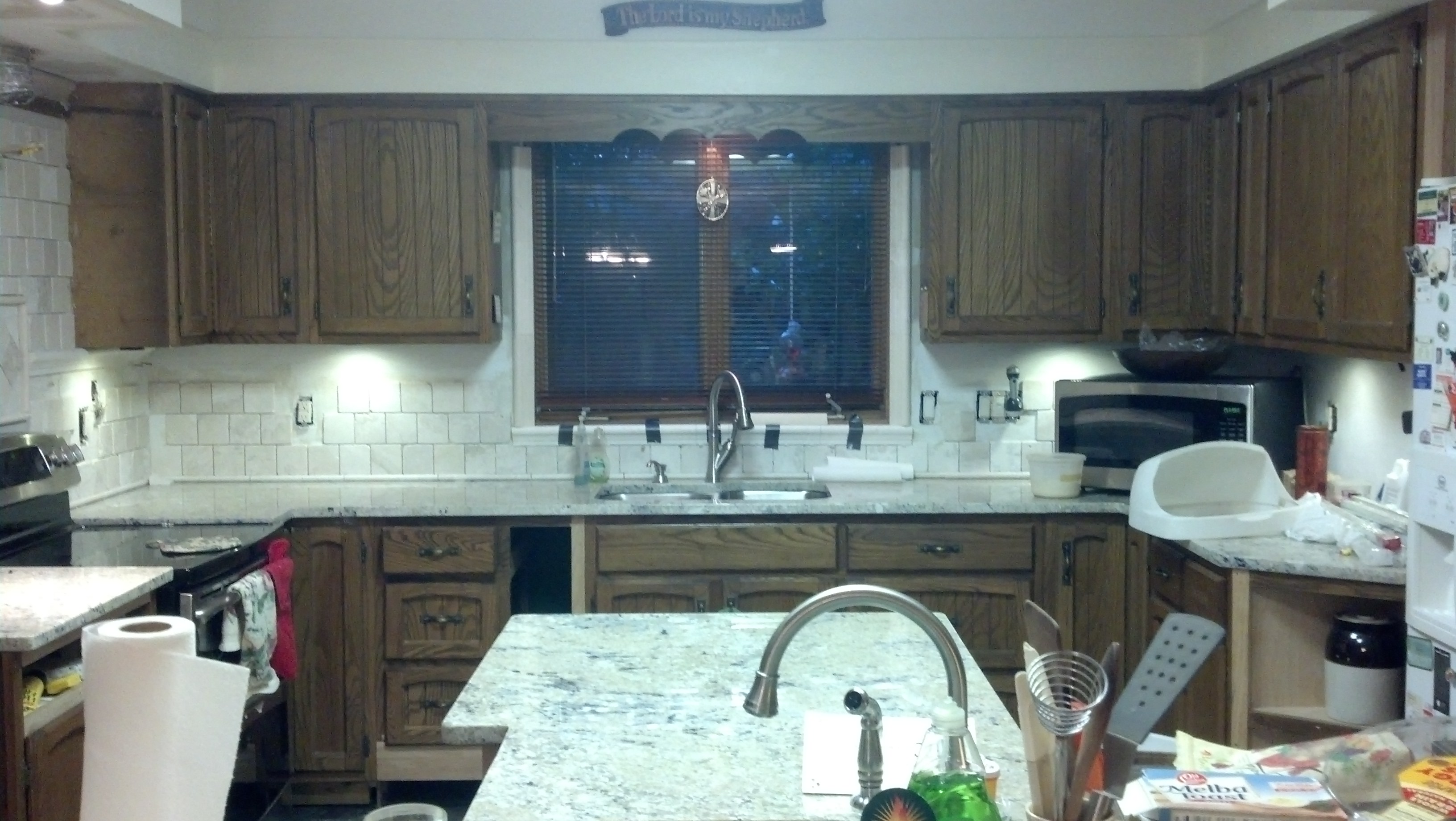
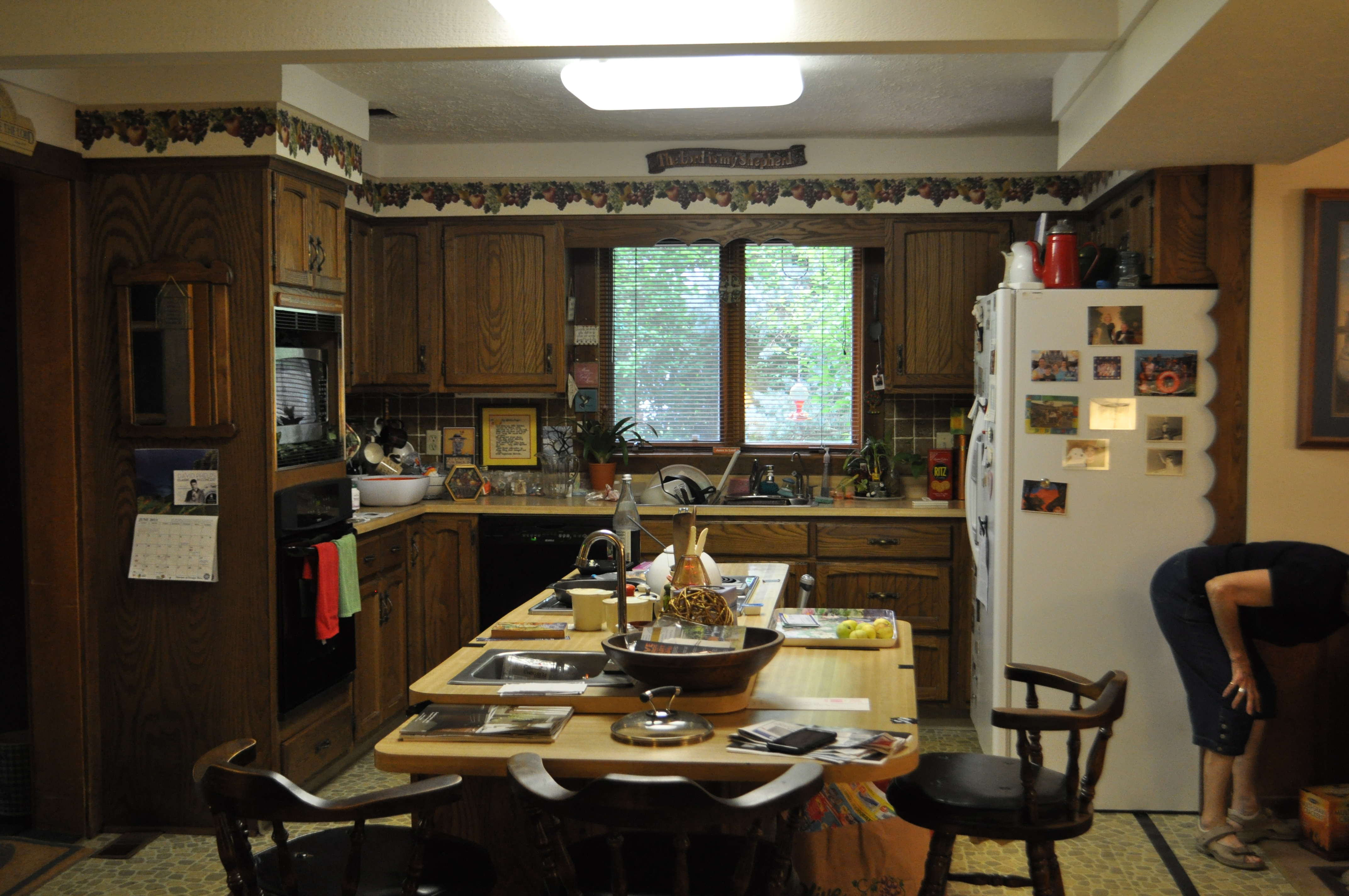
I really enjoy remodeling, as well. In fact, I find that doing a little manual labor and handling solid material like wood and stone is a nice balance to the brain work of writing and developing a non-profit. I’ll be going into high gear on the latest book project during the last few months of 2013, so I decided to take the summer to tackle a kitchen remodel project for my mom. My good friend Scott Rieger joined me in updating and re-envisioning my mother’s poorly designed 1979 kitchen. So far we’ve replaced Formica (fake) butcher block counters with new granite, tore out the old green tile and replaced it with natural field tile, reconfigured and rebuilt the island. It once had a cook top and veggie sink in it. We eliminated the cook top and expanded the veggie sink. We raised the bar counter top height, rebuilt all the lower cabinets in the kitchen, removed the old vinyl flooring, added lighting, removed a wood stove and moved the refrigerator to make more room. This week we’ll add a stainless range hood and pot rack, finish the tile, darken the cabinets, and replace the cabinet hardware. I thought It’d be fun to show you a few pictures from the project, and document the “before and after” as we wrap it up. ** UPDATE: See “Adventures in (Re) Design” for the finished project!**


Adventures in (Re)Design | Finding Divine Inspiration
[…] first, as a follow up to the thoughts in God Enjoys Interior Design, I was reminded of another excellent example of God’s enjoyment and value of design while reading […]
whiteantelopestudio
Nice! Good to see.