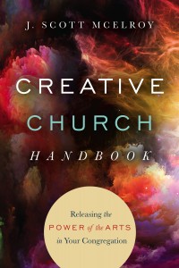
People often ask if I was involved with choosing the covers for my books Finding Divine Inspiration and The Creative Church Handbook or if the publishers do all that. I don’t know how other authors do it, but yes, I definitely am.
Choosing a book cover can be a tricky thing. Some authors may not care what the outside of their book looks like, and I sort of wish I were one of them. It would make things easier. But I write about creativity and the arts–about creative collaboration with God–and I’m an artist, so deciding on book covers becomes an even bigger deal than normal.
 The images on jacket of Finding Divine Inspiration are wonderful, but the cover would have been underwhelming had I left it solely to the publisher. One proposed version simply had doves flying in the sky (to make it clear we were talking about the Holy Spirit). After a few less than inspired designs they finally proposed the Di Vinci painting “Head of a Woman” overlaid with some of Leonardo’s invention sketches.Those images are perfect.
The journey to the final cover for the Creative Church Handbook: Releasing the Power of the Arts in Your Congregation wasn’t quite as arduous as the first’s, but I think we came up something kinda special. I’ve heard a lot of positive comments on the cover, so I wanted to share the thought process behind it.
Normally you might go towards portraying instruments of creativity like brushes or paint dollops, musical instruments or dancers for the jacket of a book like this, and those things were suggested. But instead we went bigger, grasping for a glimmer of God’s cosmic artwork.

I’m a fan of the Hubble telescope’s images of the universe. Really, who isn’t. They are astounding. I think of them as magnificent, bizarre displays of God’s playful creativity. I often show pictures of nebulae and galaxies when speaking because they can convey a number of things so well. They remind us that God is so much bigger than we imagined; many of these formations span millions of light years in size. They remind us that creativity and beauty doesn’t need to be didactic to give glory to God; it can be abstract and incomprehensible. They speak of raw primordial power that’s greater than anything Oppenheimer could have imagined. They illustrate that something of little value like gas and dust–a byproduct of long a ago event–can radiate beauty in the right light. They comfort us that even in the darkest, most remote places, God’s majesty is proclaimed.
In fact, those images of celestial fireworks are my creative ideal. They thrill and unnerve me at the same time. They speak to me in so many ways, and bring up unanswerable (on this earth) questions. They challenge me to expand my ideas of creativity.
So the publisher (IVP) and I thought what better way to point the church toward bigger dreams of what creativity can be, of opening ourselves to God’s possibilities, than to allude to His cosmic handiwork on the cover of this book.
The old saying goes that “you can’t always judge a book by its cover”. Some may be put off by the ethereal images on the front of

this book, but we hope that many others we’ll be intrigued by the mystery, the creative adventure that our God is inviting His children and His bride into. And it’s my prayer that everyone who gets past the cover will in some small way sense in the contents God’s heart of love for them.
JSM

Leave a Reply