If you haven’t heard from me for a few months, it’s not that I don’t like you anymore. It’s that I’ve  been largely indisposed on an unending project. After 650 man hours the beautiful beast called THE BIG KITCHEN REMODEL is vanquished. And I think my remodeling bug is completely sated…for now. It’s time to dive into completing the new book (more details to come), but I wanted to take a moment to show you how the remodel turned out. It is, after all, important to savor the results of the creative labor that God has given us to do. He modeled that for us in Genesis when he contemplated what he created at the end of every day.
But first, as a follow up to the thoughts in God Enjoys Interior Design, I was reminded of another excellent example of God’s enjoyment and value of design while reading The Gift of Art (IVP, 1981) by Gene Veith, Jr. recently. Veith says:
The Lord’s requirements for the tabernacle and later the Temple do, in fact, take up a good part of the Old Testament… The details of how many hooks to place in the curtains, how many cubits the frames must be, what to cover with beaten gold and what to make from bronze, are tedious to modern readers and have led to the abandoning of many a (entire bible) Scripture–reading project. But it pleased God to include theme in this holy Word. God, the designer and maker of the universe, clearly places great value on details of design, construction and artifice.
That’s true.
I hope the builders of the tabernacle and temple didn’t run into as many challenges in the details as we did in this remodel. God did give us solutions to every one, but the problems were plentiful. Fortunately, I was working with my good friend Scott Rieger on this project so we had a healthy mix of humor, trivia, and theological discussion along with the challenges.
Mom’s house was built in 1979, long enough ago that many design elements are outdated. Add to that the fact that it is on a concrete slab and the home was configured oddly to be wheelchair accessible, and you have some interesting problems. Plumbing can’t be changed, the concrete promoted years of condensation and rot in the cabinets, and there are limited options when reconfiguring the kitchen layout. But enough of the boring explanation. Here are the pictures, with slightly more interesting explanations. For those interested in some of the specifics of products and processes, I’ve created footnotes at the end of this post.
Challenges
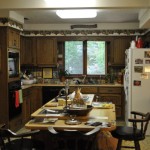
Here are just a few of the problems that needed to be addressed: (Click on the pictures to see the explanation.)
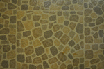
- 1970’s pebble linoleum flooring. They must have thought the green/avocado trend had staying power. That was also the original color of all the appliances. Swanky. This floor was replaced with Acacia hardwood flooring from Menards.
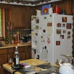
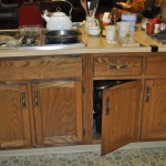
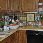
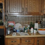
- Fake butcher block counters, green ceramic back splash, an outdated cook top, and a fridge that sticks out like a sore thumb.
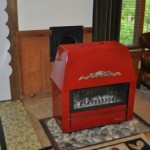
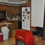
- This Belgian made wood burning stove could heat the whole house, but is an eyesore in a modern kitchen. We removed but kept it in case of apocalypse.
Before and After
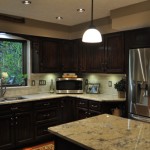
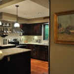
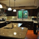
The plan was to transform this kitchen from a dated and clutter hodgepodge of design to a classy and warm Tuscan-inspired family gathering place. I think we got pretty close. Here is a sampling of before and after shots.
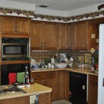
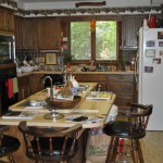
- BEFORE–The kitchen is 12 ft across, but with the stove cabinet and the refrigerator encroaching, the space becomes 7ft. The fridge is an eyesore. The counter tops are ugly and too low, actually lower than standard counter height to accommodate a shorter cook. Somehow the designers decided to make the bar even lower, creating 35 years of cramped seating. Florescent lights and a white ceiling complete the odd look.
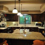
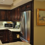
- AFTER–The island and counters have been raised, new granite counter tops (Bianco Romano) are on, pendant lights (1) replace the old florescents, the cabinets have been refinished darker (2) to contrast the new natural tile (3). The old scalloped trim above the sink has been replaced with an arch supported by corbels (4), and the frame around the windows is now detailed stone border for a classic look. The walls and ceiling have been warmed up.(5)
- BEFORE– On the south side of the kitchen, the stove cabinet eats up floor to ceiling space, the dishwasher blocks multiple cabinet doors when open, but…the grape border does add a certain granny charm.
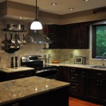
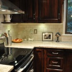
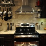
- AFTER–The upper and lower cabinets were moved to the other side of the kitchen and a new GE double oven moved in. A chimney range hood (6) was added and a pot rack (7) now hangs where the wall oven once was. New workspace is opened up on the counter below the pot rack and on the island where the cook top once resided.
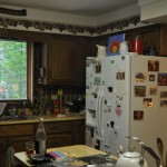
- BEFORE– On the north side of the kitchen, the horribly placed fridge takes over a whole section. The island encroaches on floorspace and a cook top on the island is awkwardly configured.
- AFTER–The refrigerator is moved over and upper and lower cabinets moved in from the other side of the kitchen. Plus, refinished cabinets, new tile, lighting, increased floorspace, and more workspace on the island. All the old, ornate door pulls have been replaced with simple, clean pewter-look pulls (8).
- BEFORE–The wood-burning stove dominates the room.
- AFTER–A wall was built where the stove used to be (right), and now houses the refrigerator, creating a finished look. Although the fridge space extends into the adjoining family room, it actually take up less space than the stove did.
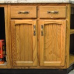
- BEFORE–The cabinet color was dated, sort of a light walnut. The pulls were a medieval antique brass. They had to go.
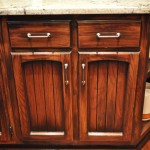
- AFTER–A four-step process of refinishing gave the cabinets a richer, antiqued look, contrasting beautifully with the granite counters, and complementing the new Acacia wood floor(9).
- BEFORE–The island was long and narrow and interupted the recommended “kitchen work triangle”.
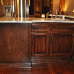
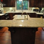
- AFTER–The shortened, heightened, and reconfigured island allows for more floor space in the kitchen, a larger and more comfortable bar, and completely hides the dishwasher, to the left.
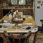
- BEFORE–Another view of the kitchen from the island. The cabinet color is pure ’70’s. The old bar stools are perfect.
- AFTER–Clean, updated, and spacious. Where once, the florescent light relentlessly illuminated the whole space, now four lighting systems set a sophisticated tone.
- BEFORE– The southwest corner is cluttered and cramped, with an unattractive dishwasher front and center and blocking cabinet access when it opens.
- AFTER–The space is bright and functional. Drawers re-purposed from the island fill the old dishwasher space.
- BEFORE–Detail of the south side of kitchen. The space is cramped and every element of design screams “I’m stuck in the ’70’s!”
- AFTER– Natural tumbled marble now covers the entire wall, unifies the space, and complements the granite counters. Stone borders add interest and detail. The space sparkles with stainless steel.
- BEFORE–More detail of the island transformation. It was narrow, long, and low. An uncomfortable place to eat.
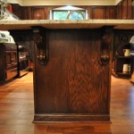
- AFTER–The shortened, heightend island provides more space to work and more bar space to accommodate four people. Classic corbels support the new counter. A new vegetable sink is larger, more functional and attractive. The raised bar counter can hide clutter on the island.
More Design Updates
In addition to refinishing or replacing nearly everything in the kitchen, we added many extra design touches. Here are a few.
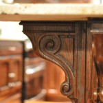
- The four island corbels, purchased online from Osborne Wood Products.
- Detail of an oak corbel. These came unfinished and we stained to match.
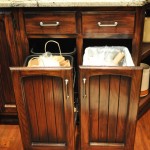
- These cabinets were moved from one side of the kitchen to the other and converted to trash and recycling bins. Photo: J Scott McElroy
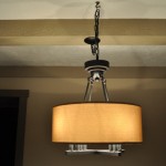
- This Allen and Roth chandelier from Lowes replaced a hideous bright brass number in the dining area.
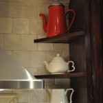
- We added this corner display cabinet next to the stove, making good use of a small space. Photo: J Scott McElroy
- The new LG 30 cu. ft. refigerator is a show stopper and a world away from the white Roper that it replaced.
- We moved the refrigerator over and lined it up with the newly installed upper cabinets, re-purposed and cut the cabinets above the fridge to fit and trimmed the whole thing in oak, creating a integrated look that makes the kitchen seem even bigger. Another corner display shelf was created below.
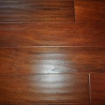
- Detail of the new Acacia Cabernet Hand scraped hard wood floor. It is engineered and floating, to go over the concrete slab floor.
- The new pulls are simple and complement the antiqued cabinet finish, creating a clean look.
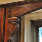
- The old scalloped trim was made into an arch and the edge routed to match the cabinets. Mini corbels were added as aesthetic supports. Photo: J Scott McElroy
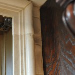
- Where once rough cedar surrounding the windows looked shabby, the new stone trim makes for a robust and classic look.
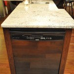
- The once dominate dishwasher is now hidden in the end of the island.
Notes:
(1) The pendant lights came from Menards. I went for a simple, classic light that could accommodate a 100 watt bulb.
(2) The cabinets required a 4-step process to get this look. 1. Liquid De-glosser was used to prepare the finish for staining. 2. A coat of Rust-o-leum Kona stain was applied to darken the cabinets. 3. A coat of Rust-o-leum Black Cherry was applied to give a rich red tone. 4. A few coats of polyurethane went on to toughen up the finish. These stains are available at Lowes.
(3) I spent a lot of time looking for the perfect backs plash tile to complement the beautiful granite. Its a more difficult task then you might think. I settled on white natural tumbled marble tiles (4”x4″) from Menard’s. It had rough edges and a lovely washed out look. This was placed in an offset, subway tile pattern for an retro look, then sealed with a simple stone sealer. The grout was biscuit colored to blend with the stone (white grout was too stark). I used tumbled marble chair rail tile to trim. The whiteish tile and light granite is a great contrast to the rich wood floors and dark cabinets.
(4) Osbourne Wood Products provided the corbels for the island and sink trim. Very nice quality and detail. I highly recommend them.
(5) The paint came from Sherwin Williams and I went with three complimentary colors. The walls were “Pavilion Beige”, the lower trim “Tiki Hut” and the upper trim and beams were a shade lighter with “Sanderling”.
(6) I found the range hood on line at Signature Hardware. This hood is made exclusively for them and though is doesn’t have some of the bells and whistles like LED display, timers and etc, it does have high air output (550 Cfm) and great design lines. You can easily spend several hundred dollars on a chimney range hood, but this 30″ came in at $299 (on sale).
(7) The pot rack is one of the few 24″ hanging styles available. Made by JK Adams, available from Crate and Barrel. Fairly reasonably priced at $140.
(8) The pulls came from Menard’s and are 96mm in a Black Nickel finish.
(9) I found the best deal for engineered hard wood floor at Menards. The Floors of Distinction brand Acacia wood in Cabernet with a hand scrapped texture completely satisfied the desire for a rich, medium dark floor that could “float” over a concrete slab floor.



Brian E. Wakeman
Readers May be interested in a new book on Christianity and the arts. The book begins with a description of an eight year community outreach project in which we employ art and poetry in mission. The book is illustrated by the author’s artwork and some of his poems. He explores poetry in scripture and makes suggestions of how churches might include more activities with poetry in congregational life. There are illustrations of theological reflection through the use of poetry. The writer explains how creative writing was therapeutic in helping him cope with treatment for cancer.
There are sections on the prophetic in poetry and similarities between verse and the wisdom literature of the old Testament. More technical chapters deal with poetry as a way of knowing and the use of poetry as qualitative research as a process and product.
Research students might be interested in the final chapter which analyses the book’s research methodology.
See KNOWING THROUGH POETIC REFLECTION
ISBN 978-1-78003-617-5
Penpress, Brighton, UK, @ £7.99, approx $11 from Amazon etc.